views
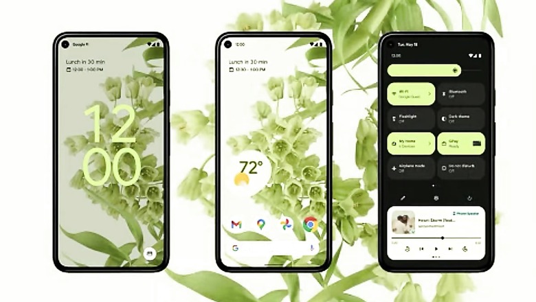
Android 12 is officially here, and so are all the rumours of the quirky interface that it was rumoured to come with. After the condensed and professional view that Google had adopted with Android so far, Android 12 brings a more playful, moody and surprisingly irreverent aesthetic that any modern day startup selling unnecessarily expensive stationary would be proud of. At the heart of the new Android 12 design is a dynamically adjusting lock screen, a more smartly bundled quick settings access, bigger and bolder notifications and menu buttons, dynamically adjusting screen lighting and colour schemes, and a new push by Google for more widget adoption.
The new design is pleasant for sure, but can seem to be a bit much for those who prefer narrower menus and simpler buttons. One thing that Google clarified amply is that Android 12 will get a lot more animations than before, and promises that these animations will not jitter and stutter over time. The reason for this is the Android core architecture taking up more than 20 percent lesser peak CPU power in background usage, which claims to reduce the strain on resources well enough to manage the new design and animations on older generation smartphones. The lock screen has also been made more dynamic – pressing the power button will light up the screen gradually from the side of the button. If you tap on the screen at the bottom, it’ll light up from there, and so on.
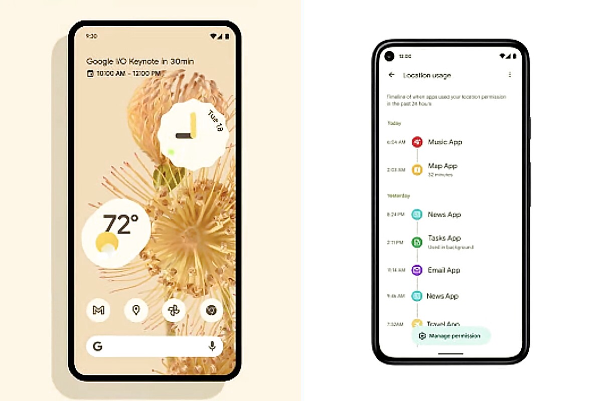
While all of this looks great, Google wants you to believe that it’s not just all about design. To convince users for this, Google has rolled out a Privacy Dashboard to users, which really just puts all the privacy features and permissions under one umbrella, and doesn’t exactly offer any feature that wasn’t already there. Under this dashboard, you can now get a microscopic and graphical view of which app is using what features on your phone, along with a ‘manage permissions’ shortcut that directly gives you access to feature-wise permissions – something that you find at the bottom of app permissions right now.

Android 12 will also show tiny icons at the top right corner to notify you which app is using what permission, in a bid to make you more aware of what apps might be sneakily activating certain permissions. However, Google has remained silent on anything that it may plan to do towards stopping apps that track your activities and serve ads – the way Apple has with app privacy permissions. It did, however, touch upon the Android Private Compute Core, which promises to do a lot of tasks such as live captioning and sensitive Google speech translate data within a walled off area locally in devices – without giving it any network access. It is a privacy positive move, but still one that somewhat skirts the bigger question.
Among other features, Google has announced more inclusive camera algorithms that aren’t just limited to Android 12, but still are worthy of mentioning. The algorithms will finally account for a more racially inclusive colour profiling instead of the blindsided push for ‘fairness’ that apps have promoted over the years. Among other features, Android 12 will also give Android TV users with a native TV remote in their phones, and also wireless Android Auto on much more cars than the limited few that support it today.
Android 12, as always, will roll out on Pixel phones first, and the beta is available right away. Our initial reactions are largely positive towards its design statement, but slightly disappointing in terms of what it has done on the privacy front (and not security). It will, of course, look different in the way other OEMs interpret it, but we do hope that this design rubs off on more OEMs going forward.
Read all the Latest News, Breaking News and Coronavirus News here. Follow us on Facebook, Twitter and Telegram.


Comments
0 comment