145
views
views
Five years later, as the company has split into two, the new minimalist logo seems more befitting with the new-age consumer brand.
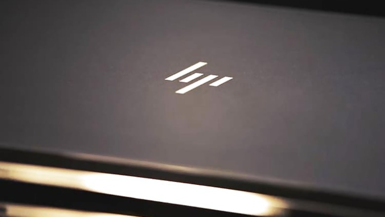
New Delhi: With the world's thinnest laptop, HP also unveiled its brand new logo which is actually an old logo that the company never used.
HP's new logo is just four minimalist slashes creating the 'HP' mark instead of a fully spelled 'Hewlett Packard' or 'hp'. The same logo first surfaced online in a 2011 brand redesign study released by Moving Brands which HP had hired to develop a new logo and brand identity, a report on The Verge notes.
Back then the company had decided against the logo. Five years later, as the company has split into two, the new minimalist logo seems more befitting with the new-age consumer brand.
HP says that the new logo will be solely used on its premium laptops, like the latest HP Spectre.


Comments
0 comment