views
Google will release its next version of Android – Android 12 (unconfirmed name) – this year. Ahead of the launch, Google shares documents and source code with major partners in order to give them time to prepare for the release. Now, a leak of Android 12 design mockups has given us the first (possible) look at the visual overhaul that the next version of Google’s operating system may come with.
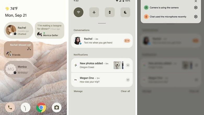
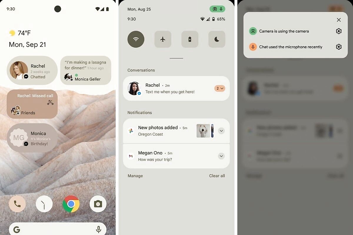
Last month, it was reported that the Mountain View, California-based giant was working on an in-depth theming system for Android 12. The design concepts that show the first mock-up of Android 12 were reportedly leaked from Google’s briefings with OEM partners and show a sand-coloured theme pulled from a similar-coloured wallpaper of hills and dunes. The color likely depends on the current theme and/or whether or not Dark Mode is enabled. It shows that the sand accents are used to colour everything from the search bar to the widgets. The first mockup also shows several ‘Conversation’ widgets for Recent Messages, missed calls, or activity statuses. The widgets measure 2×1 and include the sender’s profile image and the message preview.
Other highlights also see the extensive theming extending to app icons as well. From what can be seen in the mock up images, the icons for pre-installed apps like Phone, Clock, Camera, and more will match with the wallpaper. The Pixel launcher also seems to have been moved towards the left and shows weather above the day and date.

The images also show a black strip at top, above the search field. This, according to reports, could be a new UI elements that better prompts users about how to exit by dragging down. The widgets menu also seems to be changed, with the Android 12 mockup showing widgets in a list instead of a carousel.
The notification panel also takes up the same sand-coloured theme, further hinting at Google’s more aggressive theming technique. The notification cards are now more rounded from the edges and the quick settings buttons on the top are very large.
On the privacy front, Google is taking a similar approach to Apple’s iOS. It will alert users when their microphone or camera is being used. There will be a green pill in the top-right corner of the status bar that will shrink into a dot. When tapped from the notification panel, more information is provided with links into the settings. A new unified Privacy settings page will let users “Disable camera,” “Mute microphone,” and turn on/off Location at high-level.
While this mock-up gives us a fair idea of what Google may have in store in terms of UI changes, it is to be taken with a pinch of salt as everything is subject to change throughout the preview period. These mockups are meant to convey to smartphone makers on what changes may be witnessed.
Read all the Latest News, Breaking News and Coronavirus News here


Comments
0 comment