
views
Adding Data
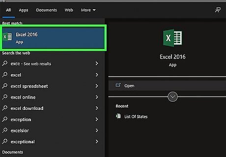
Open Microsoft Excel. It resembles a white "X" on a green background. A blank spreadsheet should open automatically, but you can go to File > New > Blank if you need to. If you want to create a graph from pre-existing data, instead double-click the Excel document that contains the data to open it and proceed to the next section.
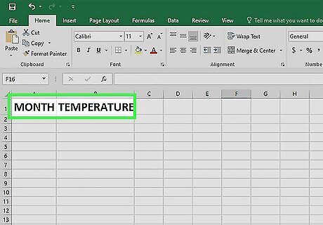
Add labels for the graph's X- and Y-axes. To do so, click the A1 cell (X-axis) and type in a label, then do the same for the B1 cell (Y-axis). For example, a graph measuring the temperature over a week's worth of days might have "Days" in A1 and "Temperature" in B1.
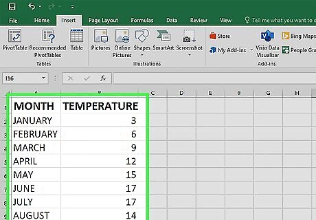
Enter data for the graph's X- and Y-axes. To do this, you'll type a number or word into the A or B column to apply it to the X- or Y- axis, respectively. For example, typing "Monday" into the A2 cell and "70" into the B2 field might show that it was 70 degrees on Monday.
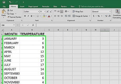
Finish entering your data. Once your data entry is complete, you're ready to use the data to create a bar graph.
Creating a Graph
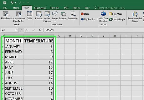
Select all of your data. To do so, click the A1 cell, hold down ⇧ Shift, and then click the bottom value in the B column. This will select all of your data. If your graph uses different column letters, numbers, and so on, simply remember to click the top-left cell in your data group and then click the bottom-right while holding ⇧ Shift. EXPERT TIP Joseph Meyer Joseph Meyer Math Teacher Joseph Meyer is a High School Math Teacher based in Pittsburgh, Pennsylvania. He is an educator at City Charter High School, where he has been teaching for over 7 years. Joseph is also the founder of Sandbox Math, an online learning community dedicated to helping students succeed in Algebra. His site is set apart by its focus on fostering genuine comprehension through step-by-step understanding (instead of just getting the correct final answer), enabling learners to identify and overcome misunderstandings and confidently take on any test they face. He received his MA in Physics from Case Western Reserve University and his BA in Physics from Baldwin Wallace University. Joseph Meyer Joseph Meyer Math Teacher Develop strong graphing skills. Drawing graphs by hand will help you develop foundational graphing skills, especially in understanding scales and axes. This will build a strong base for you to use helpful online tools to visualize complex relationships, perform calculations, and prepare for standardized tests.
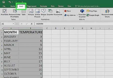
Click the Insert tab. It's in the editing ribbon, just right of the Home tab.
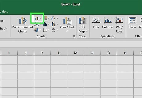
Click the "Bar chart" icon. This icon is in the "Charts" group below and to the right of the Insert tab; it resembles a series of three vertical bars.
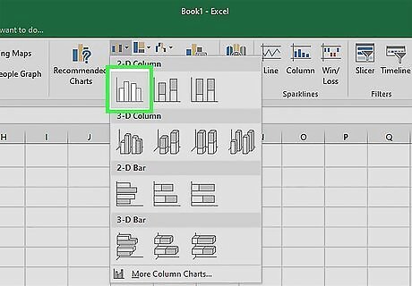
Click a bar graph option. The templates available to you will vary depending on your operating system and whether or not you've purchased Excel, but some popular options include the following: 2-D Column - Represents your data with simple, vertical bars. 3-D Column - Presents three-dimensional, vertical bars. 2-D Bar - Presents a simple graph with horizontal bars instead of vertical ones. 3-D Bar - Presents three-dimensional, horizontal bars.
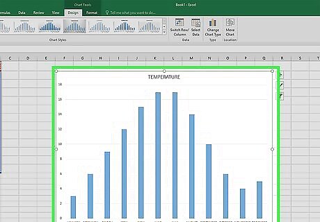
Customize your graph's appearance. Once you decide on a graph format, you can use the "Design" section near the top of the Excel window to select a different template, change the colors used, or change the graph type entirely. The "Design" window only appears when your graph is selected. To select your graph, click it. You can also click the graph's title to select it and then type in a new title. The title is typically at the top of the graph's window.




Comments
0 comment